Here’s how Acclaim Renovations & Design took on this challenging Moreland Hills kitchen update and let the light and space shine

By Patricia Nugent
In home renovations, as in life it’s always best to play to your strengths.
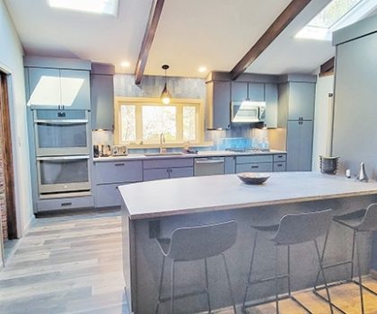
With this Moreland Hills kitchen transformation, the strengths were not being appreciated. Built in 1957, the colonial features magnificent vaulted ceilings with rustic wood beams and skylights. But because of an ill-positioned wall, the kitchen was totally cut off from the family room, leaving a tiny space with minimal countertop surface area. And to worsen matters, the only window was small and positioned too high to see through.
The homeowners, Tami and Ted Friedman, worked with designer Leigha Secue at Acclaim Renovations & Design to reconfigure things.
Let There Be Light and Space!
“By removing part of the wall separating the two rooms, we created a more open living space for them,” explains Leigha. “We added a peninsula of cabinetry for the family to gather around, with seating on both sides, to further incorporate the kitchen and living room spaces. This also drastically increased their countertop workspace. And to invite a ton of natural light into both rooms, we created a large 64-inch-wide picture window over the sink hung low enough to see through. Now they can look out to their beautiful front yard while cooking.”
Once functionality was achieved, the team focused on esthetics, putting together a transitional modern décor that still paid homage to the rustic beams above. Their gorgeous selections included contemporary cabinetry in a medium Earl Gray and Rugged Concrete Quartz Caesarstone, with an industrial feeling. “The homeowner likes how cool the counters feel, perfect for kneading his bread dough,” she adds.

The Wow Factor
A showstopping focal point is the backsplash, in Ocean Matte, with varying shades of cool medium blue that resemble shimmery fish scales. “Laying the tiles vertically emphasizes the height of the room and draws the eye upward,” she says.
Running the wide-plank, gray wood-look flooring in both the kitchen and family room makes for a cohesive look.
It’s said that God is in the details. In this renovation, that goes down to the kitchen sink. Made from a patented granite composite called Silgranit, not only is it a luxurious shade of metallic gray, but the material is also fairly indestructible, impervious to scratches and heat resistant up to 536 degrees.
For the finishing touch, Leigha and the Friedmans opted for one of Sherwin Williams’ most popular colors right now, Mindful Gray, for the walls.
“A highly versatile neutral shade in every sense of the word, this mid-toned warmish gray brings out the best in the colors it surrounds,” says Leigha. “It’s perfect in the bright space with so much natural light from every side.”
Streamlining Communications
“The number one reason people say they are unhappy with their contractor is communication,” says Acclaim’s COO Bob Potocar. “Until you’re actually into the renovation process, it’s hard to appreciate how many moving parts there are to keep up with. That’s why we work with an app called Co-Construct for our client communication. People love it. The app is simple to use and since we are all networked together, from the client to the field supervisor, that greatly reduces the chances for anything to go wrong. It saves time, too, as 24/7 communication on each job takes place more quickly.”
Every point of the renovation process is recorded on this app, from the estimation process to the proposal, selections and approvals, sketches, financial aspects, proposal and change orders.
“What used to take up pages and pages of information is now easily accessible with a few swipes on anyone’s smart phone or tablet,” says Bob.
Acclaim Renovations & Design is located at 8550 East Avenue in Mentor. The design-build firm has won numerous industry awards. Call 440-974-8082 or visit AcclaimReno.com.
